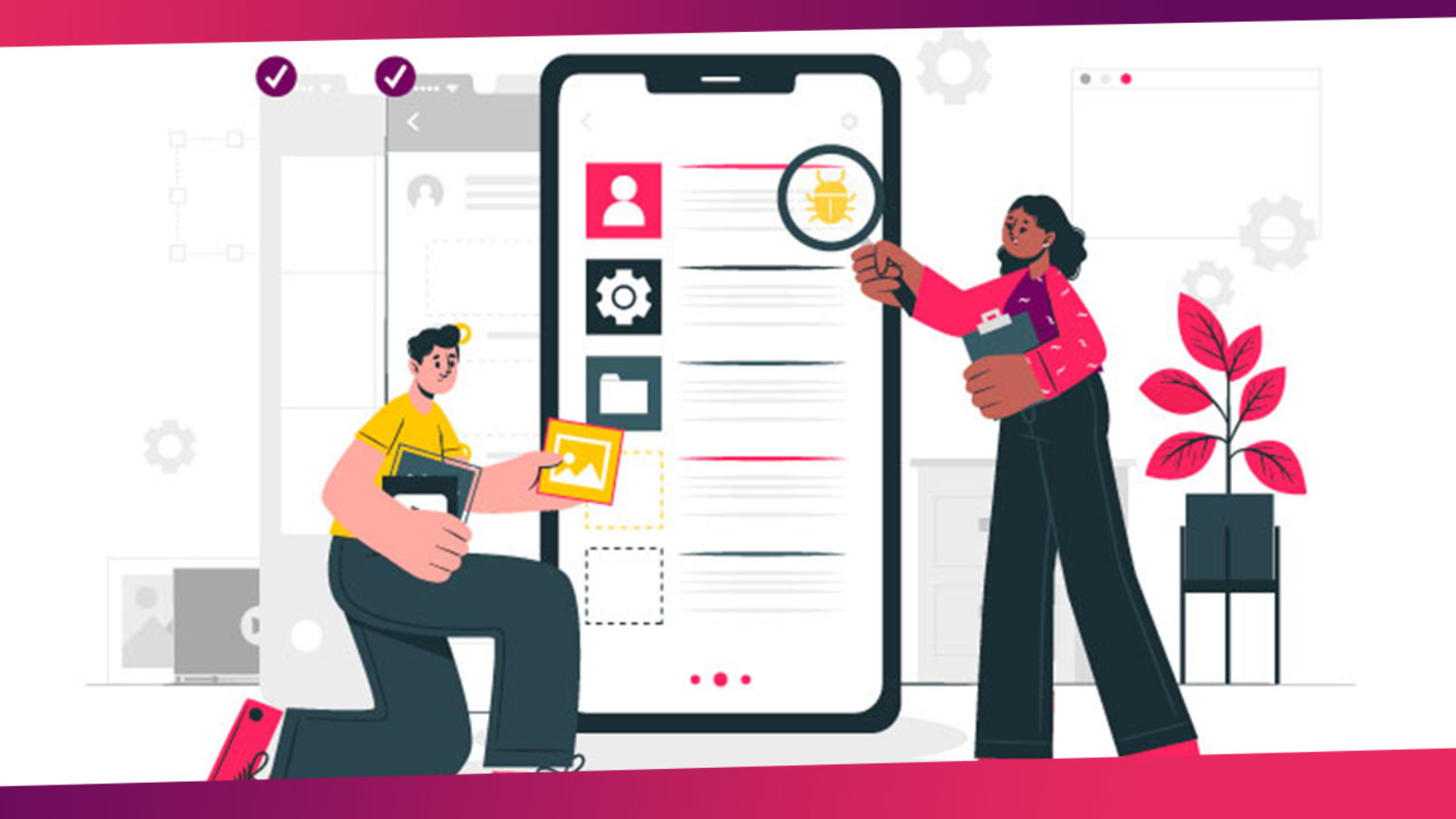
Hit the nail on the head with Mobile App design best practices to achieve a great UX (User Experience)
The market for mobile apps is growing by the day, and if you want to remain competitive in the business world, it is important for you to make sure that you come up with the right mobile app design for your business. If you are running a car dealership, it would be a great idea to come up with an app design that not only meets the needs of your customers, but also offers seamless compatibility. The result is, well you guessed it: a great User Experience (UX).
There are plenty of key features that you will want to incorporate in a mobile app that is primarily designed for car dealerships. Here are just a few.
Mobile App Consistency
Design consistency is perhaps of the utmost importance for making sure that users are able to easily recognize what the app is about. You will want to make sure that the typeface, the controls, and the colors remain the same on all platforms for which the app is created. Make sure that it is virtually the same app on both platforms. This is going to help get rid of confusion and make sure that users know your branding.
Focus on Eliminating User Doubt
An important mistake that many app developers make is that they do not provide enough feedback to the user who is engaging with the app. Eliminating user doubt is critical for the success of your app, and this is only possible when you are able to provide some sort of feedback every time a user interacts with the app.
For instance, a pop-up message should show up when a user fills out a form on your app. If a user is checking out cars available on your dealership in the app, every touch that they register should be confirmed.
Mobile App Design with Easy Navigation
The journey taken by your users to reach a specific goal is obviously important, and you need to take steps to minimize the number of steps involved in their journey. You have to make sure that you take appropriate steps so that the user is able to see different cars, place an order, book a service, or interact with your dealership in the most convenient manner. If they want to set up a meeting, they should be allowed to do that. The less steps a user has to take, the better it will be for your users. It’s only going to help in improving your contact with your end-consumers.
Simplify User Actions
Another thing that you need to do when creating a mobile app is to focus on breaking down the user actions. Instead of giving the user several actions on a single screen, provide them with a sort of home page and then focus on providing one action on each screen. For instance, if a user wants to book a service, they should be taken to a screen that allows them to choose from different options.
Once they click on a specific option, the user will be taken on a separate screen to show them all of the features within that servicing option. They can then make a booking through that separate screen.
The same can be applied for bookings as well. Users can easily make bookings for cars after checking the features and comparing them on your app. It’s a simplified way of making sure that you do not overburden the user with plenty of options.
The aim here is to make sure that a user has plenty of space to work with. Keep in mind that most users will be using the app on a screen not bigger than five to seven inches. That is why it’s important to keep the options minimal.
Focus on Different UI Elements
If you take a look at some of the most popular apps in the world, you will realize that they all follow a similar mobile app design strategy. All important elements are shown near the top of the screen, and then, they are broken down in terms of importance. More importantly, despite the limited space available on the screen, many of the apps also make use of whitespace in a very intelligent manner.
It’s all about prioritizing the amount of information that is shown on the screen. When developing a mobile app for your auto business, the focus should always be on providing relevant information. A lot of information might not be required, and can be easily omitted or shown on a separate screen. These are some simple design elements that your mobile app should focus on.
If you want a mobile app designed for your car dealership, you can always schedule a demo with us. We have built plenty of mobile apps in the past and are highly experienced in helping dealerships improve on their customer satisfaction by building tailored mobile apps.
